
icons design
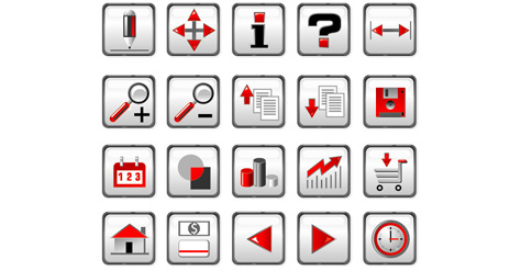
Icons are part of Graphical User Interface (GUI) design of each application and website which has at least some functionality. Similar to road signs, icons should lead you and tell what action to take now or what are your options – "go forward", "go back", "save", "print", "open"... Same as highway signs, icons must give you clear directions in very limited time. We don't have time to guess what sign means, we have to act without reading instructions.
work process:
Main purpose of the icons is to provide clear instructions to each function of the application or interface. It's very important to make sure all icons have consistent look. In many ways work on icon design is similar to work on logo image, and I always start work on set of the icon with one image. When first icon is done, I have style, type of graphics and color scheme all set for the rest of icons set, and all I have to do is to translate those parameters to each individual icon.
advice to clients:
Icons should be very easy to read and understand. If user has to ask what this image means, then icon is not working properly and it should be changed. Show your icons to as many potential users as possible before selecting final graphics.